
Well maybe this is less documentary, and more drama, given the programme description…. takes viewers on a rollercoaster ride….presented by superstar boffin…mind expanding… Using data... so that we can take control of our lives, hold our rulers to account and see the world as it really is. Phew.
Here the purpose of data takes centre stage for civilisation… “essential to monitor governments and societies”… so we end up with “citizens more powerful and authorities more accountable”. But we go even further, and even toward a sense of human being….”make sense of the world…proving a greater understanding of life on earth”. At the same time there’s a data deluge such that “the data we now have is unimaginably vast”, but of course “data doesn’t tell you anything, you have to analyse it and even make the data sing.” And perhaps the key message is to do this in an attractive and interesting way, in order to effectively engage people.
So this is the showcase for the of data visualisation that does just that, specifically that of the presenter Prof. Hans Rosling, from the discipline of global health. Inviting a fact based view of the world, here he tells visual story of the world in 200 countries over 200 years using 120,000 numbers, in four minutes. This is big stuff. Big issues, big graphics, a genuinely global perspective, and of course engaging. Powerful enough to have been viewed over 1.5 million times on Youtube in its first two weeks.

Here the power of the data is used to see five dimensions of analysis at the same time: mortality rate; income; country location, country population size and time. Of course this is about using data to provide information for positive change. For Hans Rosling this is especially helping us all see a global picture which has changed substantively, and help overcome some of stereotyping especially around the out dated labels of developing or western world.
Some of the historical examples used really exemplify this. The Swedish example of the monitoring of births and deaths in the 1800s, revealing (a) that the actual population of the country was 2m and not 20 million (b) that there were high levels of infant mortality, which led to a sustained national drive to reduce this. The other great example of Florence nightingale who’s “polar area graph” of 1855 showed the extent of preventable hospital deaths from the Crimean war, and led to a new improved era of hospital hygiene.

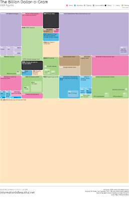
And to bring this bang up to date... the billon dollar o-gram by desinger David McCandless, showing examples of the billions of global spending in relation to each other.
This programme also attempts to fit the visualisation work within the context of the more usual statistical stuff. So something around average – including the example that the average number of legs per person is 1.999 - and then recognising the variation – described as turning numbers into shapes. So this is where the visualisations start to make a mark. And then visualisations as a link to correlation to help see how data measures vary together.
So where does this take us…..
Perhaps a key test here for visualisations is what I’ll call the “Pretty what” scale. Which is “pretty nice" through to “pretty useful”. It’s the dual meaning for pretty that works here. Pretty can have the visual meaning - appealing, attractive, beautiful – as well as the functional – considerable, rather, somewhat. So from can think of this scale from….”nice to look at, but so what?” through to “wow, what are we going to do to improve that?”
This is about knowing that the visualisations are a means an end, rather than an end in themselves. As an end in themselves they may happily qualify for “pretty nice”, and that might be just fine. I would expect this wave of visualisations might even start to move on, from pieces of design, to be an art form in their own right. The language is evolving too. This is not about graphs, this is graphics, images and animation. But of course the real output is the message. From that message the ultimate outcome is something changing for the better, and that's Hans Rosling's motivation to improve global health by enabling us to understand the issues more clearly. Visualisation is a really valuable tool in the broader analysis process.
On that note, as we’re approaching a new wave of data design, it’s worth doffing a cap the early explorers who lead the first wave in the 1980s. Those such as Edward Tufte and John Tukey who led some of the simple visualisation thinking, keeping those visualisations well grounded in the real and raw data. Those books by Tufte are now in the coffee table league, visually pleasing browsing. And how about “Visual and Statistical Thinking: Displays of Evidence for Making Decisions”, and early contender for the “pretty –useful” visualisation camp.
There’s also something here about a gentle challenge the more traditional statistical approaches. The example used here is quite light hearted. This looks at result for a ‘global health awareness’ test for students and found that statistically those students were less likely to get the right results than random. Then making the comparison to a better result (50/50) that would be achieved by monkeys. While this is light hearted it is still a challenge the relative value of the power of the traditional statistical stuff to inform and convince. So for me another indicator of the that shifting balance from left side brain thinking approach to data - statistical analytical - to the more left side visual and intuitive approach to data.
In short this is all about telling a story, and about a message at a time. So here’s another recent TED (Technology, Entertainment, Design) talk from Hans Rosling, along similar lines, this time on child mortality….”The good news of the decade”.
http://www.ted.com/talks/hans_rosling_the_good_news_of_the_decade.html
Notes:
Envisioning Information. Edward R Tufte. 1990.
The visual display of quantitative information. Edward R Tufte. 1983.
Visual and Statistical Thinking: Displays of Evidence for Making Decisions. Edward R Tufte. 1997
Exploratory Data Ananlysis. John W. Tukey, 1977